

Report Tabs
Every run opens the results as a set of tabs, with a guided rail across the top that frames the questions each tab answers. Most tabs are a table you can sort, filter, and search, with a row of key figures above it.
The tabs
Section titled “The tabs”The primary tabs, left to right, are Overview · My KPIs · Bottlenecks · Flow · Activities · Resources · Cost · Experiments. The Advanced tab, on the right with a chevron, opens a second row for the detailed ledgers: Impact Analysis · Queue Diagnostics · Routes · Gates · Bulk · Process Tables · Variables · Arrays, then Analysis Rules, where you can see and change the rules the report judges a run by. A tab appears only when your model has that kind of element, and the row of key figures across the top changes with the tab you are on.
Two structural columns appear automatically when they apply and are left out of the tables below: a Scenario column when the model has scenarios, and a replication indicator when you run several replications (figures then show as a mean with a confidence interval). Some numeric columns are hidden by default behind a visual bar; you can switch them on from the column menu, and they are all listed here.
After a warm-up, the report covers only the run that follows it. Total Cost, Cost / Entity, the share of a resource’s idle cost that each entity type carries, Cost Unused, and a resource’s scheduled, available, break, down and off-shift minutes all count from the end of the warm-up. Entities already in the model when it ends are carried in: see Carried In on Flow. Set the warm-up in Simulation Options.
The eye: show or hide a tab
Section titled “The eye: show or hide a tab”At the right end of the tab row, the eye (“Toggle tab visibility”) opens a checklist of every tab. A tick means the tab is on the row: clear it to hide the tab, tick it to bring it back. A tab your run has no data for reads “(no data)” and stays gray, because there is nothing to show on it yet. Reset to Default returns every tab to its automatic setting. Your choices are saved with the model.
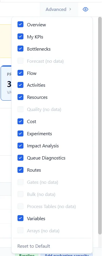
Under an industry lens, the report shows the lens’s own tabs and hides the general ones. The eye still lists the general tabs: tick one to bring it back, under its usual name.
Scenario chips in the footer
Section titled “Scenario chips in the footer”When a model has scenarios, the foot of the report carries a chip for the Baseline, in green, and one for each scenario that ran, in blue. On most tabs a chip is a switch: choose it to show or hide that scenario, and the choice decides which scenarios the tables, My KPIs and Experiments show. On Bottlenecks and Queue Diagnostics the chips pick one scenario at a time: the chip you choose is lit alone, and the tab reads that scenario by itself. Each visit to those tabs starts again on Baseline, and your other choice is back when you leave. Under an industry lens, Flow, Team and Quality pick one scenario too, and they keep the choice from one tab to the next.
Overview
Section titled “Overview”The Overview leads with the answer: a trust banner, the run’s key figures, the constraint, and the next hot-spots, so the headline result is on screen before you open a detail tab. It is covered in full in Output Report; the rest of this article is the column reference for the detail tabs.
Key figures. Five vitals sit across the top: Throughput, Throughput Time, WIP In System, Cost / Entity, and Process Efficiency. When entity types differ a lot, Throughput Time and Cost / Entity split by type and add ”· by type” to the label, rather than blending unlike work into one average. Otherwise each shows one blended figure.
Run information sits as a muted footer:
| Field | What it shows | Where it comes from |
|---|---|---|
| Run Length | How long the model ran, in simulated minutes | The simulation clock at the end of the run |
| Events Processed | Total discrete events the engine executed | Counted by the engine |
| Execution Time | Wall-clock time the run took | Timed while the engine ran |
| Simulated | When the run finished | The completion timestamp |
The scenario comparison that used to sit here now lives on the Experiments tab.
My KPIs
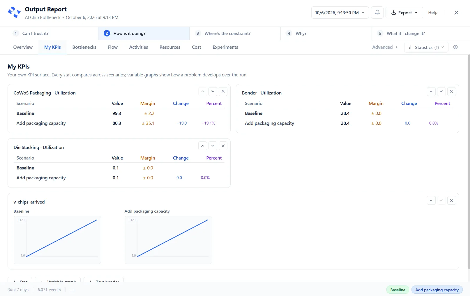
Section titled “My KPIs”Your own KPI surface, built from the report and saved with the model. Add three kinds of element and reorder them freely:
- Stat: a card that compares one figure across the scenarios switched on in the chips along the footer, Baseline first. Its columns are Scenario, Value, Margin (with several replications only: the ± of the 95% interval), Change (the difference from Baseline) and Percent. A stat can be any report cell or a variable’s value (its end value, or a per-day rate).
- Variable graph: one small chart per scenario, drawn on a shared scale, showing how a tracked variable moves through the run, with an optional threshold line. A variable needs Track Statistics switched on to chart.
- Text header: a heading to group the layout into sections.
Across several replications a stat shows its mean with a confidence interval, and a variable graph draws the median with a band from the lowest to the highest replication, so a single run never passes for the average.
Pin to My KPIs. You can also add a figure from the tab it is on. Point at a row name on Flow, Activities, Resources, the Where the time goes table on Bottlenecks, or Variables, and a pin appears beside it. On a table, the pin opens a short menu headed Pin to My KPIs with that row’s figures: choose one and it joins this tab as a stat, named for the row and the figure. On Variables, the pin adds the variable at once, as a variable graph when the variable tracks statistics and as a stat of its end value when it does not. A note confirms it, “Pinned to My KPIs”, or says “Already on My KPIs” when that card is there already.
Cards sit two to a row, or one to a row when the window is narrower than 640 px. The columns are named and colored: Value in dark, Margin in amber, Change in blue and Percent in violet. Values, margins and changes line up on the decimal point. A value of 100 or more shows no decimals and a smaller one shows one (31 reads 31.0), and a percent shows one decimal with a sign.
Bottlenecks
Section titled “Bottlenecks”The constraint tab. It fuses the ranked impact view and the queue diagnostics into one screen, so the evidence that used to take several tabs to assemble sits in one place.
Where the time goes ranks every wait-point, activities and gates alike, by the total minutes spent there:
| Column | What it shows | How it is derived |
|---|---|---|
| Name | The wait-point (a gate is tagged) | The activity or gate name |
| Class | Value-added, required non-value-added, or non-value-added | From the step’s setting |
| Time mix | Bar splitting its minutes across those three classes | The per-class share below |
| Total min | All minutes spent at the wait-point | Summed across entities |
| NVA min | The non-value-added share of those minutes | Queue wait is always non-value-added |
| % of total | This wait-point’s share of the model’s total | Its total against the grand total |
Selecting a row opens a Bottleneck detail card: its input queue depth, its average wait, the resource that binds it and how heavily that resource is used, and the temporal signature of the queue (a daily surge, an overnight build, a steady climb) with a heatmap of depth by hour and day (the days start on the run’s Start day) and a one-line key finding. From the card, Optimize This Wait Point opens PM Optimizer with the finding as an experiment, and Run creates a scenario for that experiment (its tooltip reads “Create a scenario for this experiment”). The scenario starts switched off, and the message that appears tells you to enable it and run the model again. When queue tracking is off, the card says so rather than guessing.
On a fluid, bulk or dairy run, a second card sits below, Bulk wait-points: who is at fault. The table above ranks symptoms, who waited longest; this one ranks blame, who stopped them. A line at its head names the constraint in words: the element, its kind (vessel capacity, transfer rate, machine rate, cleaning or setup), and how long it held other elements idle. Each row is one element: Element; Held others (min), the minutes it held others stopped; Mostly because it, the reason behind most of those minutes, such as “starved its consumers” or “backed up its producers”; and Held idle, the elements it held, the most blamed first.
The tab is labeled Flow. One row per entity type, and no summary row across types. By default it shows Entity Type, Avg Throughput Time, Avg Total Cost, Completed, Avg VA Time, and Avg NVA Time; the other columns are hidden until you switch them on from the column menu. Avg Total Cost is the only cost column shown: Avg Touch-time Cost, Avg NVA Cost, Avg RNVA Cost, and Cost Mix are hidden.
| Column | What it shows | How it is derived |
|---|---|---|
| Entity Type | Entity type name | The entity name |
| Created | Entities of this type created. A batch container counts as Created on its own row | Count of creations |
| Completed | Finished the whole process and exited as themselves (true throughput) | Count of completions |
| Absorbed | Became part of another entity that exited. This includes parts still loaded when their carrier leaves (an exit route too), parts riding in a container that is consumed or leaves, and a container an Unbatch takes apart | Count of absorptions |
| In System | Still present at the end | Count at run end |
| Carried In | Entities of this type alive when the warm-up ended, carried into the measured run (hidden by default). Created + Carried In = Exited + Absorbed + In System | Count at the end of the warm-up |
| Flow | Bar of completed, absorbed, and in-system | The three counts above |
| Time Mix | Bar of value-added, required non-value-added, and non-value-added time | The average time figures below |
| Cost Mix | Bar of touch, non-value-added, required non-value-added, and other cost | The average cost figures below |
| Balk | Bar of entities turned away, by reason | The balk counts below |
| Avg Throughput Time | Average time from creation to exit | Averaged per entity |
| Avg VA Time | Average time in value-added activities | Averaged per entity |
| Avg NVA Time | Average time in non-value-added states: queues, NVA activities, transit | Averaged per entity |
| Avg RNVA Time | Average time in required non-value-added activities | Averaged per entity |
| Avg Total Cost | Average total cost per entity, everything included | Sum of all cost categories, per entity |
| Avg Touch-time Cost | Average value-added cost per entity | Value-added processing, moves, and resource use, and any Per-Entity Cost |
| Avg NVA Cost | Average non-value-added cost per entity | NVA processing, moves, and queue cost, and the entity’s Waiting Cost |
| Avg RNVA Cost | Average required non-value-added cost per entity | RNVA processing and moves |
| Balk (No Entry) | Turned away because the queue and capacity were full on arrival | Counted on arrival |
| Balk (Shift) | Turned away because the resource went off shift | Counted at shift change |
| Process Efficiency | Value-added share of total time | VA ÷ (VA + NVA + RNVA) × 100 |
Key figures: Total Entities Created, Total Exited, Avg Throughput Time, In System.
Activities
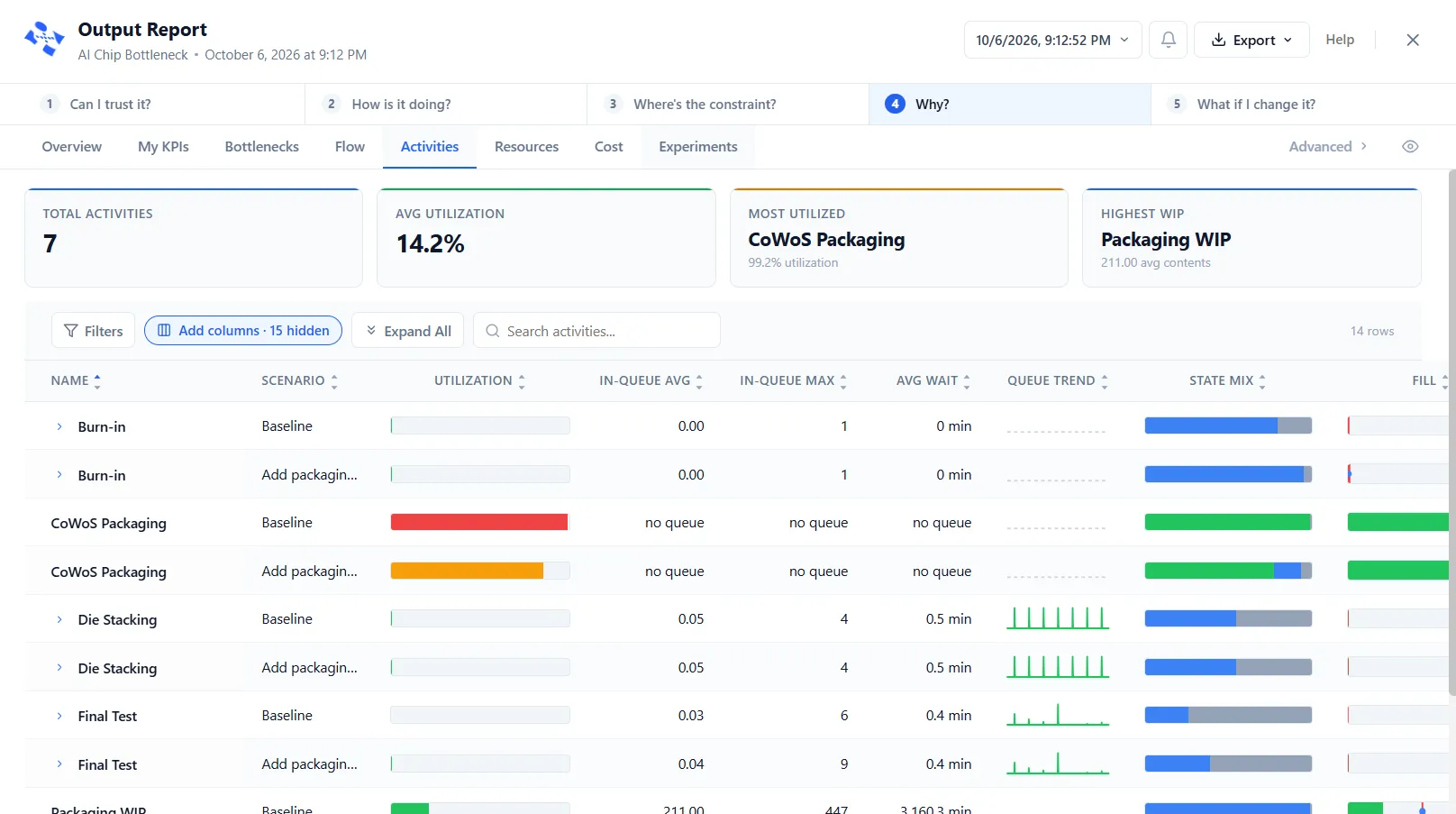
Section titled “Activities”One row per activity, with expandable input-queue (InQ) and output-queue (OutQ) sub-rows. The state columns split by capacity: an activity with capacity 1 reports Operation / Idle / Waiting / Blocked; capacity above 1 reports Empty / Partial / Full. By default the table shows Name, Utilization, In-Queue Avg, In-Queue Max, Avg Wait, Queue Trend, % Blocked, Entries, and Exits; the other columns are hidden until you switch them on from the column menu.
| Column | What it shows | How it is derived |
|---|---|---|
| Name | Activity name (InQ = input queue, OutQ = output queue) | The activity name |
| Utilization | Percentage of capacity in use, on average | Average contents ÷ capacity × 100 |
| In-Queue Avg | Average number of entities waiting in the input queue (reads “no queue” when the input queue’s capacity is 0) | From the activity’s input queue |
| In-Queue Max | Peak input-queue length during the run | The observed peak |
| Avg Wait | Average time an entity waited in the input queue | Averaged per entity |
| Queue Trend | Input-queue depth over the run: rising means it builds faster than it drains (needs queue tracking) | Drawn from the queue’s history |
| State Mix | Bar splitting time into working, waiting, blocked, idle (or full / partial / empty) | The percent-of-state figures below |
| Fill | Bar of average contents against capacity, with the peak and the end value | Average, maximum, and ending contents against capacity |
| Flow | Bar of entities that exited versus those still stuck | Entries and exits |
| Avg Time | Average time an entity spent here | Measured per entity, averaged |
| Scheduled Hours | Total time the activity was scheduled to be available | From the activity’s shift |
| % Off-Shift | Off-shift time as a share of the whole run | Off-shift time ÷ run length |
| Off-Shift Time | Minutes the activity was off shift | Measured |
| Entries | Entities that entered | Counted as entities enter |
| Exits | Entities that left | Counted as entities leave |
| Avg Contents | Average number of entities present over time | Time-weighted average |
| Capacity | Most entities allowed at once | From the activity’s properties |
| Cap Max | Most entities present at any point | The observed peak |
| Current Contents | Entities present when the run ended | Count at run end |
| % Operation | Share of time actively processing (capacity 1) | Time in the operating state ÷ scheduled time |
| % Idle | Share of time empty but available (capacity 1) | Time idle ÷ scheduled time |
| % Waiting | Share of time waiting for a resource or dependency (capacity 1) | Time waiting ÷ scheduled time |
| % Blocked | Share of time an entity could not move on because the next place was full (capacity 1) | Time blocked ÷ scheduled time |
| % Empty | Share of time with no entities (capacity above 1) | Time empty ÷ scheduled time |
| % Partial | Share of time partly occupied (capacity above 1) | Time partly full ÷ scheduled time |
| % Full | Share of time at capacity (capacity above 1) | Time full ÷ scheduled time |
Key figures: Total Activities, Avg Utilization, Most Utilized, Highest WIP.
One row per gate. The Kanban columns appear only when a gate uses Kanban cards.
| Column | What it shows | How it is derived |
|---|---|---|
| Gate Name | Name of the gate | The gate name |
| Default State | Normally open or normally closed | From the gate’s setting |
| Entries | Entities that arrived at the gate | Counted as entities arrive |
| Released | Entities that passed through | Counted as entities pass |
| Blocked | Entities that had to wait | Counted when held |
| Flow | Bar of released versus blocked | The two counts above |
| Avg Wait | Average wait, including entities still waiting at the end | Averaged over waiting entities |
| Max Wait | The longest single wait | The observed maximum |
| Wait | Bar of average against maximum wait | The two figures above |
| Avg Queue | Average number waiting at the gate | Time-weighted average |
| Max Queue | Peak number waiting | The observed peak |
| Throughput (/hr) | Entities released per hour, counted after the warm-up | Released per hour over the time after the warm-up |
| % Open | Share of run time the gate was open | Time open ÷ run length |
| State Changes | Times the gate flipped open or closed | Counted |
Kanban columns (when Kanban is used): Cards Sent, Avg Cards Avail, Avg In Transit, Card Util %, Starvation Events, and Blocked (No Cards).
Key figures: Total Gates, Total Blocked, Avg Wait Time, Max Queue.
Process Tables
Section titled “Process Tables”A two-level table. The outer row is one Process Table; expand it to see one inner row per table row.
| Column | What it shows | How it is derived |
|---|---|---|
| Process Table | The table’s name | As authored |
| Evaluations | Times the table was checked during the run | Counted |
| Rows Fired | Total matching-row hits across all checks | Counted |
Inside, each row shows its match condition, its Match Count (times the condition matched), and its Execution Count (times it ran).
Resources
Section titled “Resources”One row per resource. When the model defines groups, a separate Resource Groups table sits above it. The resource table shows a Signal column by default, and a model with a caseload resource adds the caseload columns (see Resource Caseload).
| Column | What it shows | How it is derived |
|---|---|---|
| Resource Name | Name of the resource | The resource name |
| Utilization | Share of scheduled time busy (can exceed 100% with overtime) | Busy time ÷ scheduled time |
| State Mix | Bar: in use, waiting, overtime, on break, down, idle, off-shift | The percent figures below |
| Cost Mix | Bar: used, overtime, break, downtime, unused | The cost figures below |
| Units | Quantity of this resource available | From the resource’s properties |
| Scheduled Hours | Total scheduled hours, breaks included | From the resource’s shift |
| Overtime Hours | Hours worked past shift end | Measured |
| Wait Hours | Hours in setup or travel before starting work | Measured |
| Times Used | Times the resource was used | Counted |
| Signal | Plain-language health of the resource: Near ceiling, Healthy, or Headroom, and Binding constraint for the single resource that limits the model | From the report’s analysis rules |
| Avg Time Per Usage | Average length of one usage | Averaged |
| Cost Used | Cost while in use during scheduled time, including the wait hours (setup or travel) and Cost Per Use times the times used | Rate × (time in use + wait hours), plus Cost Per Use × Times Used |
| Cost Unused | Cost while on shift but idle | Rate × idle time (the Idle rate in Idle / Busy mode) |
| Cost Break | Cost during scheduled breaks | Rate × break time (the Idle rate in Idle / Busy mode) |
| Cost Downtime | Cost while down | Rate × downtime (the Idle rate in Idle / Busy mode) |
| Cost Overtime | Cost for overtime | Overtime rate × overtime |
| Total Cost | All cost categories added up | Sum of the costs above |
| % In Use | Share of scheduled time in use, overtime excluded | In-use time ÷ scheduled time |
| % Wait | Share of scheduled time assigned but waiting | Wait time ÷ scheduled time |
| % Overtime | Share of scheduled time in overtime | Overtime ÷ scheduled time |
| % Idle | Share of scheduled time idle | Idle time ÷ scheduled time |
| % On Break | Share of scheduled time on break | Break time ÷ scheduled time |
| % Down | Share of scheduled time down | Downtime ÷ scheduled time |
| % Off-Shift | Off-shift time as a share of the whole run | Off-shift time ÷ run length |
| Off-Shift Time | Minutes off shift | Measured |
| Busy Time | Minutes in use | Measured |
| Idle Time | Minutes available but idle | Available minus busy, break, and off-shift |
| Available Time | Minutes available (on shift, not down) | Measured |
| Lost Units | Units lost when an entity exited the model while holding the resource (work preempted at shift end does not count) | Counted when the entity exits |
Caseload columns (when a resource carries a caseload): Avg Caseload, Peak Caseload, Cases Assigned, Cases Handed Off, Cases Inherited, Cap Violations, Unassigned Wait (hrs), and Time Over Cap (hrs).
Resource Groups table (when groups are defined): Group Name, Members, Utilization, Units, Times Used, % In Use, Scheduled Hours, and Total Cost, each rolled up across the group’s members.
Key figures: Total Resources, Avg Utilization, Most Utilized, Total Cost.
Routes
Section titled “Routes”One row per route (a connector from one place to the next).
| Column | What it shows | How it is derived |
|---|---|---|
| Route | The path, source to target | The connected activity or queue names |
| Classification | Value-added, required non-value-added, or non-value-added | From the route’s setting |
| Usage Count | Times entities traveled this route | Counted |
| Move Time | Total travel time on the route | Summed |
| VA Time | Value-added time on the route | Summed |
| NVA Time | Non-value-added time on the route | Summed |
| RNVA Time | Required non-value-added time on the route | Summed |
| Total Cost | Cost of using the route | Usage × cost per move |
Key figures: Total Routes, Most Used Route, Total Usage, Total Cost.
Variables
Section titled “Variables”One row per variable. The history columns (Total Assignments, Avg Time / Assignment, Average, Std Dev) fill in only when the variable has statistics tracking switched on in the Logic Sheet.
| Column | What it shows | How it is derived |
|---|---|---|
| Variable | Variable name | As defined |
| Type | Data type (Real, Integer, Descriptive, DateTime) | From the definition |
| Initial | Value at the start | From the definition |
| Total Assignments | Times the value changed (tracked variables) | Counted |
| Avg Time / Assignment | Average time the value held between changes (tracked) | Span of changes ÷ number of changes |
| Min | Lowest value held | The observed minimum |
| Max | Highest value held | The observed maximum |
| Current Value | Value at the end | The final value |
| Range | Bar of min, max, average, and spread | Min, max, mean, and standard deviation |
| Average | Time-weighted average value (tracked) | Value weighted by how long it was held |
| Std Dev | Time-weighted spread (tracked) | Standard deviation over time |
| Final | Value when the run ended | The final value |
Rows open a drill-down with the full history and a step chart. Key figures: Total Variables, Tracked, Total Changes, Active Variables.
Arrays
Section titled “Arrays”One row per array.
| Column | What it shows | How it is derived |
|---|---|---|
| Array | Array name | As defined |
| Type | Data type (Integer, Real, Descriptive, Date) | From the definition |
| Dimensions | Rows, rows by columns, or rows by columns by depth | From the definition |
| Total Cells | Number of cells | Product of the dimensions |
| Cells Changed | Distinct cells written during the run (needs tracking) | Counted |
| Usage | Bar of cells changed against total cells | The two figures above |
| Min Value | Smallest value across cells | Scanned |
| Max Value | Largest value across cells | Scanned |
| Import Source | File the data came from, if imported | From the definition |
Rows open a drill-down with the array contents and change history. Key figures: Total Arrays, Total Cells, Cells Changed, Tracked.
The tab is labeled Cost. Not a single table: a cost breakdown chart plus four sub-tables. Costs are worked out from the run’s results and your model’s cost settings.
Location costs, Location, Type (activity or queue), Processing cost, Per-Entity cost, Total, and Entries.
Resource costs, Resource, Cost Mix, Cost Used, Cost Unused, Cost Break, Cost Downtime, Cost Overtime, Total Cost, Units, and Times Used.
Route costs (when routes carry a cost), Route, Usage Count, Cost Per Move, and Total Cost.
Entity costs, Entity Type, Count, Initial Cost, Waiting Cost, Touch-time Cost, and Total Cost.
Key figures: Total Cost, Activity Cost, Resource Cost, Entity Cost, and Inventory Cost (holding plus ordering). See Cost for more.
Experiments
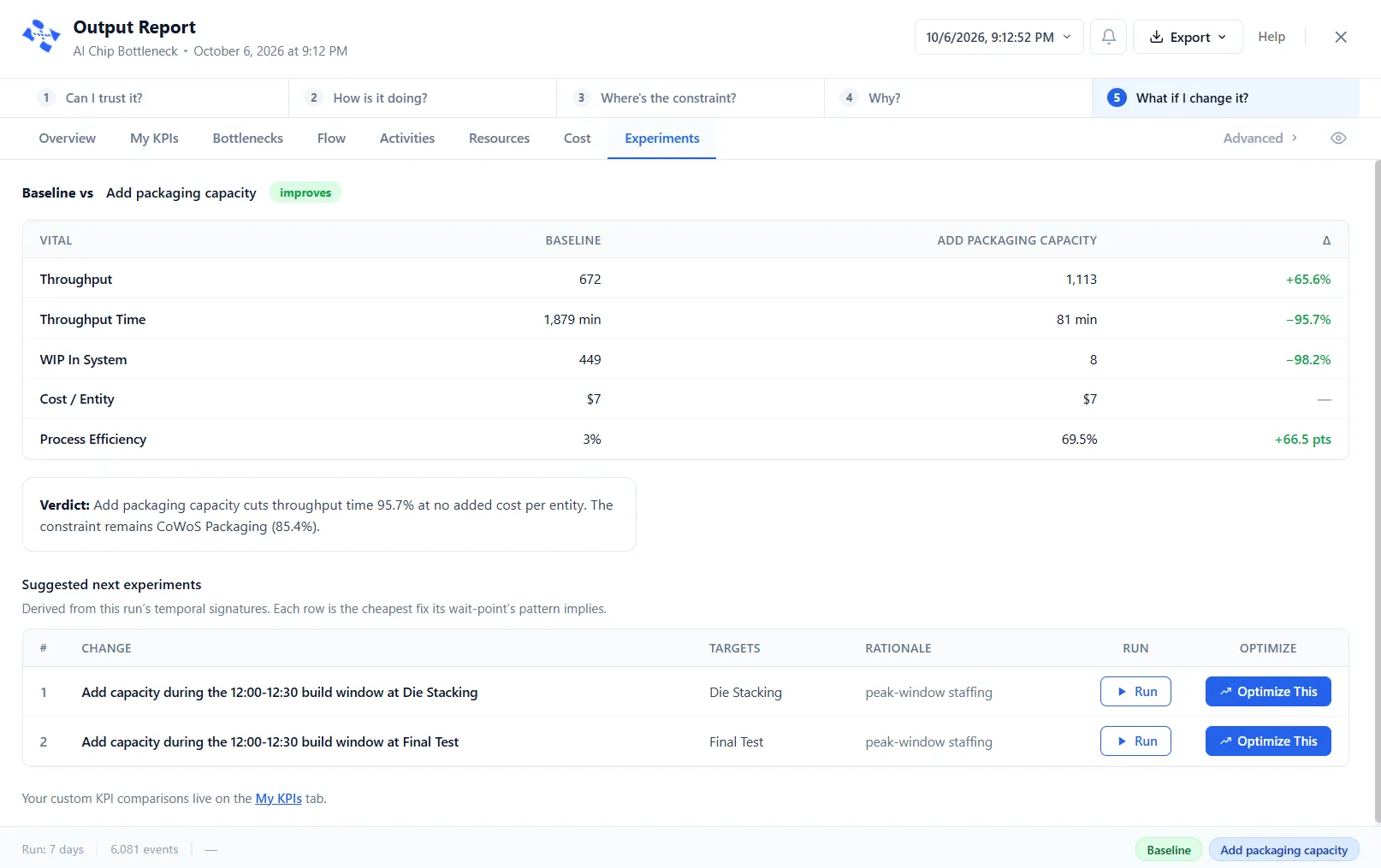
Section titled “Experiments”The last step of the funnel: what if I change it? It compares Baseline against a scenario you pick on the five vitals, states a verdict in words, and lists the next experiments to try.
| Column | What it shows |
|---|---|
| Vital | Throughput, Throughput Time, WIP In System, Cost / Entity, and Process Efficiency (the split ones by type) |
| Baseline | The figure for the Baseline run |
| The scenario’s name | The same figure for the scenario you selected (the column is headed with its name) |
| Δ | The change, colored green when it helps and red when it hurts |
A chip on the header says whether the scenario improves, regresses, is mixed, or shows no change. The verdict reads the change back in plain language, including where the constraint moves. A priced bulk or dairy run adds Money rows, with “Where the money moved:” and “How these were priced”. Suggested next experiments ranks the cheapest fix each wait-point’s pattern implies, and each row can become a scenario with Run (it is created switched off, so enable it and run again) or be handed to PM Optimizer. Custom stat comparisons live on the My KPIs tab rather than being repeated here.
Impact Analysis
Section titled “Impact Analysis”Now under Advanced, and summarized by the Bottlenecks tab. One row per activity, ranking where time is spent. See Impact Analysis for the full view.
| Column | What it shows | How it is derived |
|---|---|---|
| Activity Name | Activity name | The activity name |
| Status | Value-added, required non-value-added, or non-value-added | From the activity’s setting |
| Entries | Entities that entered | Counted |
| Total VA Min | Value-added time here (value-added activities) | Entries × average processing time |
| Total RNVA Min | Required non-value-added time here | Entries × average processing time |
| Total NVA Min | Non-value-added time, including all queue wait | Summed |
| Total Impact | All three added together for this activity | VA + RNVA + NVA |
| % of VA | This activity’s share of all value-added time | Its VA ÷ total VA |
| % of RNVA | This activity’s share of all required non-value-added time | Its RNVA ÷ total RNVA |
| % of NVA | This activity’s share of all non-value-added time | Its NVA ÷ total NVA |
| % of Total | This activity’s share of the grand total | Its total ÷ grand total |
| % VA of Total | Value-added share of this activity’s own time | Its VA ÷ its total |
| % RNVA of Total | Required non-value-added share of its own time | Its RNVA ÷ its total |
| % NVA of Total | Non-value-added share of its own time | Its NVA ÷ its total |
Key figures: Activities, Total VA Time, Total NVA Time, Process Efficiency.
Queue Diagnostics
Section titled “Queue Diagnostics”Also under Advanced, and folded into the Bottlenecks tab. A ranked view rather than a plain table, showing where and when work piles up. See Queue Diagnostics for the full view. The Top Queue Problems table ranks the worst queues:
| Column | What it shows | How it is derived |
|---|---|---|
| Rank | Position 1 to 5 | Ordered by non-value-added time |
| Queue | Queue name | The queue name |
| Impact | Share of total queue delay | This queue’s NVA ÷ all queue NVA |
| Max Queue | Peak length | The observed peak |
| Pattern | The kind of build-up (for example steady or peak-hour) | Classified from the run |
Selecting a queue adds a header (rank, share, peak, pattern, and the worst time window) and a heatmap of severity by day and time. The days start on the run’s Start day.
Analysis Rules
Section titled “Analysis Rules”Also under Advanced. The rules that decide what the analysis calls a constraint, a bottleneck, a surge and a cause are not fixed: they are data you can read and change, and the report re-classifies the run it already has, with no re-run. They are saved with the model, so each model keeps its own. For example, the Signal column on Resources is read from them.
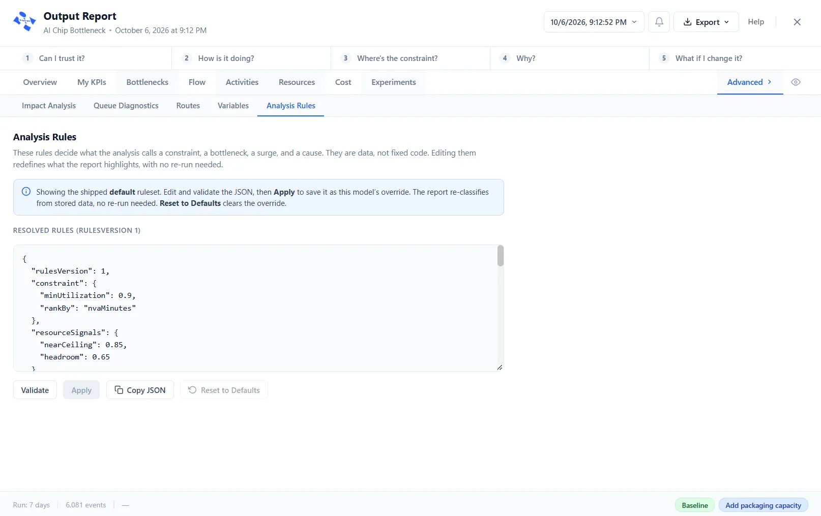
A note above the box says whether you are looking at the default rules or a custom override saved with this model. Edit the text, then:
- Validate checks your edit and says what is wrong: “Valid: this ruleset passes all structural checks.”, “JSON could not be parsed”, or a count of rule errors with each one listed.
- Apply validates the text and saves it as this model’s override. It is gray until you change something.
- Copy JSON copies the text.
- Reset to Defaults clears the override and puts the default rules back. It is gray while the default rules are showing.
LegacyHow this worked in the previous version
General reports
Section titled “General reports”Ten general reports automatically expose information to identify system problems. The reports include:
-
General
-
Entities
-
Activities
-
Activity by % (Multi Cap)
-
Activity by % (Single Cap)
-
Resources
-
Resource by %
-
Variables
-
Impact Analysis
-
Hotspot Evaluator
General
Section titled “General”-
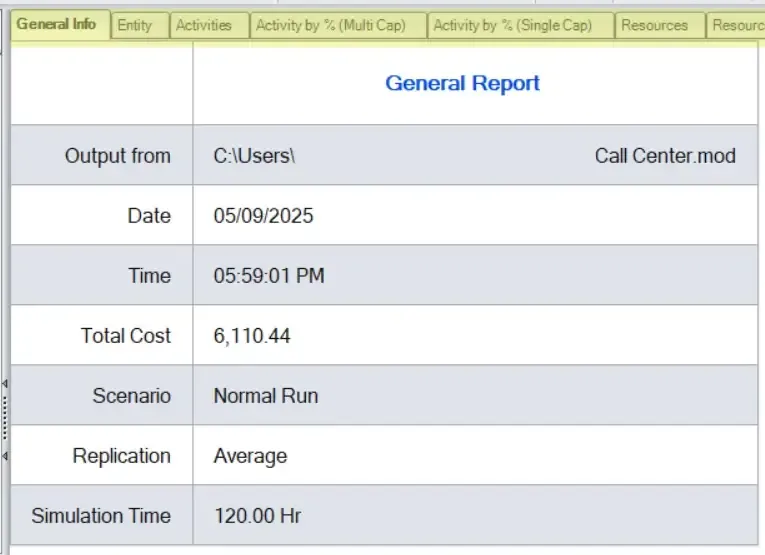
Output from: Name and location of the model data
-
Date: Date the model was simulated
-
Time: Time the model was simulated
-
Total Cost: Represents the sum of all the cost to run the process plus the addition of all unused resource costs
-
Scenario: Type of scenario run. It will list the scenario name when scenarios are run or “Normal Run” when a single scenario is simulated.
-
Replication: Type of replication. When single replication is done only average report is shown. When multiple replications are run, average report as well as individual replication results are shown separately.
-
Simulation Time: Total simulation time of the model.
Entity
Section titled “Entity”
-
**Entity Name: **Names of all the entities that have been added to the model with statistics enabled.
-
Qty Processed: The total number of entities processed through the model. Only exiting entities count in Qty Processed.
-
**Average Cycle Time: **The average time each entity spent in the model.
-
Cycle Time is the total elapsed time to move a unit of work from the beginning to the end of a process. Cycle time includes process time, during which a unit is acted upon to bring it closer to an output, and delay time, during which a unit of work is spent waiting to take the next action.
-
Average VA Time: Average value-added time each entity spent being processed in activities or moved from one activity or storage to the next, does not include the time waiting or time at any activity that is declared as NVA (Non-Value Added).
-
Activity time begins as soon as an entity enters the capacity of the activity, and ends when the entity leaves the capacity, either by moving to the output queue or to the next location in the model. Value-added time is accrued only from a TIME statement in the action logic or from the General tab’s Time field.
-
Average RNVA Time: Average time each entity spent being in activities set to RNVA. RNVA activities include actions that are required but do not add value (as defined by the customer). An example of a RNVA activity might include a governmental inspection that neither the producer nor the customer identifies as value-adding.
-
Average NVA Time: Average Non-value-added time each entity spent at an activity declared as NVA, the time an entity spends being idle, waiting for a resource, in storage, traveling on a route, waiting in an input queue or when a Wait Until statement holds it.
-
Average Touch Time Cost: The average cost of the entity. This is based on how much work was done on the entity by activities, resources etc that have an associated cost. Unused resource cost is not applied to the average cost, to see cost with unused resource cost added, see the Average Total Cost.
-
Average Total Cost: The total cost for each entity. Total Cost represents the sum of all the costs to run the process plus the addition of all unused resource costs. Includes sum of;
-
Used / Unused Resource cost.
-
VA, NVA, and RNVAcosts for each entity.
-
Initial entity cost.
-
Entity waiting cost.
-
**Process Efficiency: **Formula: Average VA Time / Average Throughput Time
-
Weighted Overall Process Efficiency: Becomes accessible when two or more part or entity types exit the model. The weighting factor is the quantity of entities exiting the system. Entities having more exits provide a higher contribution to the weighted efficiency. The formula follows (Process Efficiency Entity X1 * Qty Processed Entity Y1) + (Process Efficiency Entity X2 * Qty Processed Entity Y2) + … / (Qty Processed Entity X1 + Qty Processed Entity X2 + …).
Only entities that exit the model have statistics collected for them and reported. If an entity is renamed at some point in the model, the original entity will not report statistics. Only the new name will show stats. Another instance when the entity summary will show 0’s is when one entity is attached to another without detaching them before they exit the model.
Activities
Section titled “Activities”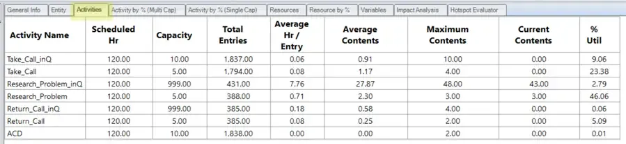
-
Activity Name: Names of all the activities that have been added to the model with statistics enabled.
-
**Scheduled Hours: **The total number of hours the activity was scheduled to be available, as the result of any shift file it uses, defined in the properties dialog.
-
Capacity: Capacity of the activity, defined in the properties dialog.
-
**Total Entries: **The total number of entities that entered the activity, not including entities arriving to be attached. Entities arriving that have been previously grouped or have entities attached to them to form a single entity only count as one entry.
-
Average (Sec/Min/Hrs/Days) Per Entry: Average time an entity spent at the activity, time value is based on what is selected in the Simulation Options window. This time may include partial times from the beginning and end of the actual run time.
-
Average Contents: Average entities in the activity at the same time.
-
Maximum Contents: The maximum number of entities that occupied the activity at the same time, over the course of the simulation.
-
Current Contents: The number of entities remaining at the activity when the simulation ended.
-
**% Utilization: **The percentage of capacity occupied, on average, during the simulation.
Activity by % (Multi Cap)
Section titled “Activity by % (Multi Cap)”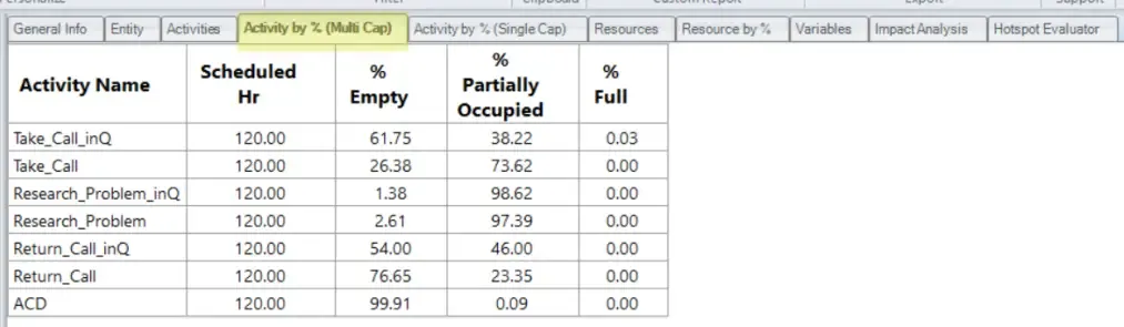
-
Activity Name: Names of all the activities that have been added to the model with statistics enabled and have a capacity of more than 1.
-
**Scheduled Hours: **Scheduled hours for the activity, defined in the properties dialog.
-
**% Empty: **Percentage time the activity was empty.
-
**% Partially Occupied: **The percentage of time the activity had entities but was not filled to capacity. (100% of time - %Full - %Empty)
-
**% Full: **The percentage of time the activity was filled to capacity with entities.
Activity by % (Single Cap)
Section titled “Activity by % (Single Cap)”
-
Activity Name: Names of all the activities that have been added to the model with statistics enabled and have a capacity of 1.
-
Scheduled Hours: Scheduled hours for the activity, defined in the properties dialog.
-
% Operation: The percentage of time the activity was actually processing an entity.
-
% Idle: The percentage of time that no entities were at the activity, but the activity was not down.
-
**% Waiting: **The percentage of time the activity was waiting for a resource or another entity in order to begin processing or move to the next activity. Any delays in processing routing Action logic are counted as waiting time.
-
**% Blocked: **The percentage of time entities spent waiting for a freed destination. “Blocked” means that an entity cannot move downstream in the model due to insufficient capacity at the next location. The entity has to sit at the current location after the normal processing time is complete until there is room available for it to move.
Resources
Section titled “Resources”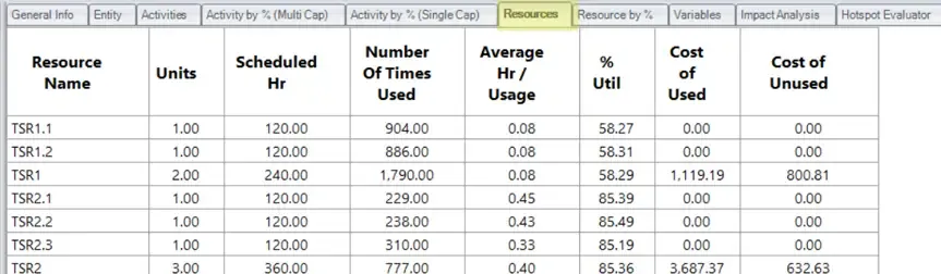
-
Resource Name: Names of all the resources that have been added to the model.
-
Units: Number of resources assigned, defined in the properties dialog.
-
Scheduled Hours: The total number of hours the resource was scheduled to be available, as determined by the assigned shift file, defined in the properties dialog.
-
Number of Times Used: The total number of times the resource has been acquired to transport or process an entity.
-
Average (Sec/Min/Hrs/Days) Per Usage: The average time the resource is used by an entity. Time value is based on what is selected in the Simulation Options window.
-
**% Util: **The percentage of time the resource spent moving or processing an entity. (100 * (Number of Time Used * Average Minutes Per Usage)) / (Scheduled Hours * 60 min/hr)
-
**Cost of Used: **The total cost of used resources. If the resource is on break, no cost is charged.
-
**Cost of Unused: **Total cost of unused resources. Represents the time you must pay for, even though the resource may not be actively working on entities. The column helps you quantify the resource waste in your process. Unused costs are not included in the report which uses ABC costing.
Resources are reported both by unit and collectively. The collective unit (aggregate) report for a resource totals the first three fields and averages the next two fields discussed above.
Resource by %
Section titled “Resource by %”-
**Resource Name: **Names of all the resources that have been added to the model.
-
Scheduled Hours: Total scheduled hours for the resource during simulation, defined in the properties dialog.
-
% in Use: The percentage of time the resource was being used by entities.
-
% Idle: The percentage of time the resource was available but not in use.
-
% Down: The percentage of time the resource was unavailable due to shifts or options selected in the Availability tab for the resource.
Variables
Section titled “Variables”-
Variable Name: Names of all the variables that have been added to the model with statistics enabled.
-
**Total Changes: **The total number of times that the value of the given variable changed during the simulation.
-
Average (Sec/Min/Hrs/Days) Per Change: The average time that a given variable remained at any one value. Time value is based on what is selected in the Simulation Options window.
-
Minimum Value: The lowest value of the variable during the simulation.
-
**Maximum Value: **The highest value of the variable during the simulation.
-
**Current Value: **The final value of the variable when the simulation ended.
-
**Average Value: **The average value of the variable during the simulation.
-
**Std Dev.: **The standard deviation value of the variable during the simulation.
Impact Analysis
Section titled “Impact Analysis”-
**Activity Name: **All the activities that have been added to the model with statistics enabled.
-
Status: Type of activity.
-
**Entries: **Total entities that passed from the activity.
-
**Total VA Min: **Is based on the time an entity has spent in the capacity of the activity, even if an entity is waiting for a resource, since the activity space is being utilized. Based on the total time all entities that have passed through, are currently in the activity, or are in the activity queue.
-
Total RNVA Min: Is based on the time an entity has spent in the capacity of the activity that is declared RNVA, even if an entity is waiting for a resource, since the activity space is being utilized. Based on the total time all entities that have passed through, are currently in the activity, or are in the activity queue.
-
Total NVA Min: Is based on the time an entity has spent in the input or the output queue of an activity (depends upon an input/output queue cap). Based on the total time all entities that have passed through, are currently in the activity, or are in the activity queue.
-
Total Min: Total time spent by an entity in an activity. Based on the total time all entities that have passed through, are currently in the activity, or are in the activity queue.
-
% of VA: (Total VA of the activity / Sum of VA of all activities) * 100
-
% of RNVA: (Total RNVA of the activity / Sum of RNVA of all activities) * 100
-
**% of NVA: **(Total NVA of the activity / Sum of NVA of all activities) * 100
-
**% of Total: **(Sum of ‘Total VA’, ‘Total RNVA’, and ‘Total NVA’ of the activity / Sum of ‘Total VA’, ‘Total RNVA’, and ‘Total NVA’ of all activities) * 100
-
**% VA of Total: **(Total VA of the activity / Total Min) * 100
-
**% RVA of Total: **(Total RNVA of the activity / Total Min) * 100
-
% NVA of Total: (Total NVA of the activity / Total Min) * 100
Learn More: What is Impact Analysis?
Hotspot Evaluator
Section titled “Hotspot Evaluator”The Hotspot Evaluator leverages robust Impact Analysis to visually pinpoint the top 10 areas that will deliver the most significant results.
The Hotspot evaluator shows you the following:
-
NVA: Non Value Adding
-
VA: Value Adding
-
**RNVA: ** Required Non-Value-Added